
Throughout my media work I have decided to research into many different magazine styles and genres as I believe it could give me a good opportunity the look and create different ideas to formulate my own magazine. By looking at the magazine above I was able to gather a design for my own magazine cover, I like the way that this magazine was laid out as the photo was very big in the centre of the page and also it grabs the reader’s attention when looking at the magazine section. I also like the layout of the page as there is not a lot of text on the page and although there is quite of information at the top of the page, their isn’t too much that I looks overpowering. I like the way that shapes are used around the page as I believe that they fit in with the magazine (synchronised). Also the text around the figure looks good as it’s wrapped to fit in. The colours blend in well as they are very bold as well as the image on the page.
bbcmusicmagazine.com/
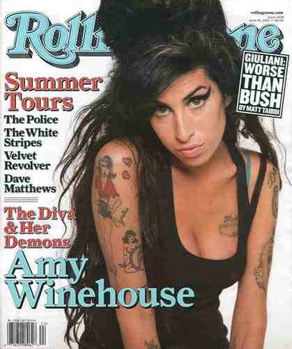
Secondly I researched the Rolling Stones magazine I came to the result that I believe that this was the less relevant magazine in my research as I didn’t like the layout of the page and also I didn’t believe that it was help me to gather ideas for my own magazine . I didn’t like the layout of the magazine because of the design , I believe that there should have been more text around the page and also to have more interesting bold colours that blend well together . I think this would entice the readers eyes to the front cover more. Meanwhile I do like the idea of the image in the middle of the page and the text around the figure. But I do believe that the colour scheme lets the magazine down as it is very dull and uninteresting
http://www.rollingstones.com/

And lastly I like the layout of this magazine as I believe that the image looks very active and outgoing, and it gives off that effect on the magazine itself. I like the layout of this magazine as I believe the image gives off a really good effect throughout the whole front cover. I think that colours chosen work well as they are very bold and contrast against the image making everything stand out. Also the bold black writing used against the white background makes the writing stand out and appeal to the reader. Finally the masthead works well because of the font used and also the colour, the slice effect used in the masthead gives off the effect that the magazine is slighting underground and street but trying to remain formal.
http://en.wikipedia.org/wiki/Natalie_Portman
No comments:
Post a Comment