Wednesday 29 June 2011

The meeting , newly and improved

Firstly we decided to create the script , using the same idea that we did with out first meeting . by doing this we stuck to the idea of using the tory line of the hills , and two friends meeting up to mend the broken friendship. By creating the script based on the hills the last time to improve the  short clip we decided to change the start of the film  by instead of the friends arranging to meet up they  bump into each other accidently and begin to start talking .
Our Script is listed below  :
( Jennifer and ria  bump into each other )

  • ria : kisses her teeth 
  • jen : ohh its you
  • whats going on ? we havent spoken in time  , things between us never got sorted . i heard you had something to say to me . 
  • i'm talkin to you 
  • Ria : i dont even know why your talking to me to be honest 
  • ( person in background "kiss teeth . your rude"0
  • jen : WHAT !!!!??
  • how can you  not be bothered to listen to me , you dont even look up when i come  and speak to you . your willing just to throw all our friendship away .
  • your just so stubbor , i dont undersgtand  so many people told me , you had something to say to me 
  • and here i am tryna mae an effort an talk to you and you dont even wanna talk to me at all . 
  • Ria : phhssstttt  
  •  My story board and shooting  schedule is listed below

Tuesday 28 June 2011

As media studies review ( my island )


  • In my island i  placed out a treasure map  ,  to show how i believe my as year went in media  studies , i believe that year 12  media was a success as i was able to complete the my coursework to the grade that  i wanted to achieve i was also able to have more time to perfect my coursework by taking new pictures and completing the exam with confidence  . On my island i placed a big bright sun on the top of the page , in the middle i placed things that i enjoyed to do , which was , coursework , blogging and photography as i believe i put the most effort into theses part of the task . By doing this i was able to use new and learn new skills :
  • Photoshop
  • Pages 
  • Imovie 
  • Blogger 
  • Macs 
  • Slide share
  •  I then moved onto the birds in the sky , that went to then went to the grey cloudss , this represented the parts of  the media course that i found difficult and tricky such as :
  • deadlines 
  • Essays 
  • Exams 
  • i believe that this year i have learnt alot about the music industry and i hope that next year i have the same success that i have had doing the as level . 


Wednesday 15 June 2011

Year 13 - filming

Task to complete : Task given was to create a short film that was based on a meeting of any kind .
My group consisted of :
Chelsea , Imogen and Benita
The task was to give us practice in filming and editing a short film . Before we started our coursework when we returned in september . we were given an hour to create two films between the four of us . using a flip camera , and a tripod  to hold the camera still.
We decided to base our meeting based short film on the a Tv show  The hills (mtv reality show)  . The short film was about a friendship that had been broken up and tried to mended although one of the friends did not want to resolve the problems ,
we had golden rules about filming around the school which were :


Firstly we had to create a story board, adding shot types and acts for the characters. We then had to make a script to match up with the storyboard in the theme of a meeting, firstly we made the film without a tripod, I believe that the film was a good start and the camera wasn’t as shaky as we believed it would be without a tripod. But on our second filming session we found it more difficult to position the camera where we wanted to, to produce the right camera shoot.


My group preferred to use the camera hand held as it was much easier to control the camera and a move it into the shoot type we need to form . Throughout this process we were able to connect the mini clips together on the mac's .Thorughout our filming we stopped and started to change shoot type and change position of of the camera to show fasical expressions.


I believe that the storyline behind the film was a good idea. And worked well thoughtout the filming  , also when we did connect the clips together they fitted together well , as if it was continutity editing . To develop the short film in a better way  i believe that we could  change the setting to create a better environment to the situation , also make the background sound lower, so you hear the actors voices properly .

 Click below to see the link to our film

Thursday 5 May 2011

Evaluation Question 7 .

Looking back on my preliminary task, I believe has made a big improvement throughout my progression to complete my full product. As creating and completing the preliminary task allowed my develop my  skills and improve the majorly to a higher standard to where I am confident to use Photoshop and pages without assistants .By creating the prelim I was able to experience how the software worked and was able to progressed my skills to a professional level . I feel that my final completion of my music magazine is a great piece as it relates to a real life magazine and as I was inspired by many other magazines that I felt were eye catching I believe I was able to make a eye catching magazine that highlighted everything need to make a good outcome .by using many different codes and conventions that u was unable to do whilst making my prelim as I was inexperienced .  I am extremely pleased with my music magazine as I think that I s eye catching and attracts the right target audience .The only thing I would change would be to add some more jewelery onto the models to make them look more urban rather than classy

Evaluation Question 6 .


Evaluation Question 5 .


Through doing my research and planning of building my magazine and having my magazine published, I was able to look how many different magazines were published, distributed and delivered to many different audiences in many different ways. Many urban magazines I found were based online such as:


• Yorap


• Flavour


• Singersroom


Looking at a variety of many different online urban magazines I was able to see that most of their websites promote a lot of merchandise, rather than promoting other new hip-hop artist. However looking at printed magazines sold in local stores I found had a website that wasn’t very appealing to it viewers so they would influence their readers to buy the magazine in person, rather than using the internet to catch up with the magazine. I believe that it is good idea to produce a website to for readers to log on to now and then, to catch up with out of date copies of the magazine if they couldn’t afford to buy the magazine that week. Having a website was also allow readers to have unlimited access to the latest thing going on in the magazine. I would like to have my magazine retailed in local newsagents and big supermarkets, such as Tesco, Asda and Sainsbury’s. I also think it’s a good idea to have my magazine advertised and sold in music shops such as HMV , as it sales a variety of music selection including my own genre so whilst in a music shop such as HMV your able to collect the latest style magazine that connects to your favorite genre . I also thought I would be a good idea to have my magazine retailed in stores such as footlocker and JD sports as I believe the promote a sort of urban dress style which is also portrayed in my magazine. The idea I had was when I personally saw the magazine flavor being distributed freely in footlocker and as magazine and flavor are along the same lines of topics, I thought it would be a good way to distribute my media product. I think it would be helpful if my music magazine was promoted at local raves and clubs that play my sort of genre of music promoted in my magazine


Evaluation Question 4 .


I believe that this question 4 was the most important question, as it was the main aspect as producing my music magazine. Throughout my music magazine I was representing the particular social group of my age group. In my magazine I hoped to represent a exciting , fun audience .To produce this convention I used informal vocabulary that I believe relates to the social group I have intended to present my magazine too .
I also used a variation of colours to make the magazine bright bold and vibrant to keep the reader interested.
I decided to relate to the local teenagers in my community , I wanted to create a magazine that would promote a social community that are friendly and encouraging of new talent .I believe that models in my magazines attract the particular social group that I have decided to attract . They have achieved this as by the clothing they are wearing, such as smart casual which doesn’t include the classic 'hood' look. By the models wearing the clothes they are wore I believe they have made a larger audience be attracted to the magazine as they have grins on their face it makes the magazine look friendly and socialable. Also the dress sense is very clean and tidy promoting the right dress type of a pimp style R&B Hip-Hop music video.


And lastly the price of the magazine promotes the magazine to young students as it affordable for a low student income, encouraging them to buy the magazine. Also the free £5 HMV voucher entices the reader to buy the magazine, as young people are in too music and freebies.


Evaluation Question 3 .

Evaluation Question 2 .

By haven chosen to produce a music magazine containing the music genre of Hip-Hop and R&B I was able to develop many different codes and conventions that are also contained in a real music magazine I was able to used this feature as doing research I was able to Articulate various ideas that are used in a real life magazine such as promotions , advertising , information , gossip etc . By constructing my music magazine and using the music genre of R&B I referred my magazine to a typical afro- Caribbean magazine which are usually involved and circulated around that sort of population. Also by including a glamorous male alongside to females artist I have constructed a magazine for both genders which is similar to other magazine although they usually only have one main artist on the front cover. This also makes the magazine more diverse. Other Codes and convention I used was the basics that must be on / in a magazine such as: a barcode, issued date, images, headlines and a masthead. 

Evaluation Question 1 .


Music Vibe is the latest top charted magazine in the stores, attracting a wide range of boys and girls aged 16-19, featuring the new fresh hottest talent of the hip hop and funky fresh R&B top titles . The sort of articles found in this magazine will include: interviews, top ten download lists, new fresh Djs, up and coming artist and hot spots for clubs to attend to hear the fresh sound of the streets. The different articles will interest the reader as the main reason they may want to read on as the magazine will be focus on diversion and surveillance allowing them not to be bore-d by everyday life .I believe that theses sections will attract my target audience as it is what a 16-19 year old would be encouraged and engaged to read about.  I believe that many of my readers shall be students in either in college or in university. Proven that their income shan’t be very high reasoning being I have decided to put the price of my magazine at £2.00.Ibelieve that this is a reasonable price for a music magazine and as most student may have a part time job I don’t think that £2 is a lot of their own allowance each month . My audience shall be able to access music and hot spots reviews highlighted inside the magazine where they will be able to download and listen to the music featured online and also on specific music channels and on the radio. I believe that with the students extra cash they may spend their money on music (cds, albums iTunes) and headphones and other electrical appliances. In their spare time they may go out to latest clubs and hot spots for fresh talented artists, or downloading music and reading about the latest top artist that has some new fresh luscious lyrics. In my magazine I believe that things that may be advertised in my magazine  is fresh funky clothing designed by talented street artist , new cds , trainers and special offers in local music stores such as Hmv and sound space .


Front Cover

Contents Page


Double page Spread


Evaluating Production Work

This snap shot of the front cover image is showing where i have edited my first image in photoshop . and using different tools and filters to create a different effect on the image

Wednesday 27 April 2011

Research into the music genre of R&B + Hip-Hop Final


Throughout doing research of my magazine I came to the conclusion of R&B and Hip-Hop genre, by this I was able to cancel down all the main magazines I would be researching. Flavour magazine was one of my favourite magazines as I believe it was aimed at the same age range of my target audience. Flavour is an online based magazine produced by local young people involved with the youths in there community. I was also highly interested into this magazine as I know one the journalist. I felt that this was very inspiring and exciting as I was able to share her view on magazines and the music industry. I like the front cover of flavour magazine as it is bold and the colours contract with the models clothing and the main headlines. This is very eye catching and makes the magazine look neat. Flavour is a free magazine which is usually promoted in shops such as footlocker, local youth clubs and radio stations. The text on the page is very clear it is not over whelming, the white text on the black background helps you quickly read what’s going on in the magazine. The masthead is covered by one of the models head although they do not do this in every issue, it still entices the reader to pick the magazine up as it looks interesting a looks as if it involves the reader


With vibe magazine I found that this magazine was a very urban magazine that focused mainly on afro American people. This magazine was great for me too look at as I was able to create and use the different codes and conventions from this magazine on my own make version. This magazine was one of the best magazines I have worked with as it was same features that I wanted to add to my own creation (magazine). Vibe magazine is based on the fresh new artists that are producing R&B and Hip-Hop music. By looking at this magazine I was able to gather new ideas that could inspire me for my own magazine as they were based on the same genre. Vibe magazine tend to always place the main artist that is featured in the magazine on the front cover. The artist is usually an artist that is new and popular within the community. The artist occasionally overlaps the masthead. I believe that shows identity of the magazine 'Vibe' itself. Looking at previous Vibe magazine front covers they always produce there magazines to be very eye catching and short and snappy. They achieve this by only having one image of the model on the front cover and hardly having any text around the models head this entices the reader to read on into the magazine by looking at the next page (the content page).
                                                                         www.vibe.com/


Within doing research of R&B and Hip-Hop styled magazine I noticed that they were all American based and that only one of the magazine I had focused on was made and published in the UK. Looking at the magazine Rap Up I found helpful number one as it was relating to the same topic as my magazine and also I believe it was aiming to attract the same target audience as I wish too. Rap Up I believe is a very attractive magazine because the glamorous images on the front cover of fresh new artist, I believe that the magazines tend to create the effort that its target audience is both male and female because of the colours used and also the context used inside the magazine. I have noticed with the style range used in most magazines they have a glamorous model on the front cover that is featured in the magazine and have the text around the model. Within in this front page I have noticed that the text isn’t over whelming for the reader and has enough to keep the reader interested. The font style of writing is highly attractive as it is bold bright and creative which allows the reader to appreciate the context of the idea behind the big clear writing.


www.rap-up.com/


www.singersroom.com/


Monday 4 April 2011

Magazine Prices Research

Mixmag being a British dance music magazine it doesn’t relate to my own magazine but we have used the magazine itself as research so I believe it is also to add in this section. The price of the magazine is priced at the less of £4 although adding a subscription to the magazine it’s a better price for most. The magazine is often made for people with a standard income allowing them buy the magazine on a regular bases. I believe that £4 is too expensive to price my own magazine as it is targeted to a certain age group of young adults which I doubt they would be able to afford on weekly bases. If I make my magazine priced so that it is affordable to most on a low income, it will seem as if it’s promoted to all classes, races ethnicities and gender.


Being an R&b and Hip-hop magazine I believe that this magazine dedicated to mostly teenagers and young adults, the price for this magazine is reasonable as it is affordable to most students. Being priced at £2 - £4 , I believe that this is a good price range for most magazines as it is affordable to most also as the magazine only comes out fortnightly it caters to my own target audience of students as its not ranged at a high price. So people with a low income in their household will b able to buy the magazine.


Mostly the same as Vibe magazine, aimed towards the African American readers, the magazine is marketed weekly, jet magazine contains man various topics from fashion to beauty tip, latest black entertainment view on music and films. the magazine is priced from £1.99 - £3.99  as like vibe magazine I believe this is a reasonable price for the right target audience , also as the magazine contains a lot of quality information for all readers it will entice them to  pay the price for the magazine.


              Flavour - http://www.flavourmag.co.uk/tag/rb/
Flavour Magazine is a free bi-monthly urban entertainment and arts magazine in the United Kingdom. The publication targets men and women 18–34. It presents interviews and discussions on people in music, art, TV, film, beauty and fashion.


Tuesday 29 March 2011

Contents page Research

I researched many content pages on music magazines and I decided to choose this Q the music to annotate on. I’ve decided to use a few ideas from this contents page such as having the big picture of a group feature in the magazine. Also as it has the headings of the articles featured in along one column. I like the idea that the page numbers and titles are in bold and additional text is in dimmed text. I also like the fact that the contents page is split into sections, I would to use this in my own magazine


I like the layout of this contents page as I believe that it is very eye catching and attractive to all viewers. I think that it is a great idea to use a large image on one side of the page; also the layout of the letters spelling out 'contents' is very bold and unique as you don’t normally see the letters set out like that. The colour combination is great as it is bold and striking once you open the magazine. I think this is one of the only contents pages I’ve seen with hardly any text on it. personally I wouldn’t use this technique in my own contents page as it’s not very informative of what’s going on in the magazine . But on the other hand this could be a good effect to use by not using a lot of text as the reader may lose interest if they have a lot to read on the contents page itself.


The contents page produced by the magazine 'Kerrang' I believe was a good set up for my research as I was about to look at a different styles contents page that featured a variety of images that related to pages featured in the magazine I liked the idea of this technique as I believe it was a great way to entice the reader to show them and allow them to be a part to the magazine .Also this way they would be to see images of things that was going on as well as text inside the magazine . I found this contents page was very loud and outgoing also represented by the music featured in this magazine. The Yellow letters upon the black background made the letters stand out to the readers showing importance and highlights main headings .Also the page numbers in the bold black writing allows the reader to see things clearly and quickly if they want to search for a certain page. The black outline of the photos give them all status and identity as they have their own boxes, showing that each image has a different story to tell.   http://www.kerrang.com/


Finally I added this contents page to my research as I really like the layout of the page; the masthead is very bold and eye catching. The picture draws you in to the contents throughout the page as its attractive and fits into the page because it is black and white .I believe that as the image is black and white but it features a red heart ,proves the point of Kanye west new song ' love lock down ' featured in the magazine .the page number are also in bold writing to show indication of which page contains what story ,Also the sections of the magazine are divided into different categories  I think that this is a good feature as it makes it easier to view and find different pages about different articles .Lastly a good thing about this page is that it has hardly any writing upon it ,so I doesn’t over whelm the reader

Monday 28 March 2011

Design , Layout and Technique Research


<>


Vibe magazine uses bright bold colours to advertise their magazine. They mostly place a photo in the middle of the screen of the main artist featured in the magazine, also placing the main concept about the artist alongside the image of them. The title is always at the top of the page which is bold. All subheadings and lures are also in bold writing in colours that contrast with background making them stand out. Attract you attention more. In vibe magazine they never cover the artist's face with writing; they fit the writing around the page / character. However the images look very airbrushed and glowed, as if the figure was jumping out the page.


Whereas in Complex they use a variation of bright and bold colours to attract the attention of young teenager’s. They also use a range of different fonts and styles such as bubble writing and adding images in the back ground of text. In this magazine cover they also feature the text around the image and don't cover the image in any way. The image also is very bold and clear of the main artist. I like this layout as I believe it is very attractive and eye catching; I hope to use certain aspects of the front page in my design, too help grab passes by attention to pick up my magazine and want to buy it. Although on this front cover there is hardly any writing and is quite basic. It looks very good as you don't have many things to read but everything on the page is like a lure wanting you to read on. I like this idea as it’s very simple but attractive.


 In the source magazine they allow the front image to cove some of the title, although u can still make out the words behind the image. The image covers the whole page whilst the writing is placed on top, meanwhile in other magazines the headlines and lures are placed around the image. I found this magazine very simple but it covers the essential needs for a magazine as it is attractive and eye catching with the different fonts of writing and the bold clear image. Also the border around the page catches the reader’s attention as contrasts with the title. This bold border and title shows a sign of importance.


Out of all the magazine I have researched about designs and layouts I believe that Wonderland was the best presented because of the dramatic effect given off by the image and the way the text is placed onto the page .Firstly the title is very common and basic but it high lights the status of the magazine because of the black and white against each other and the bold letters stand out above everything else. Also as the artist is wearing black making her stand out on the white background. The white background also shows where light is delegated from the camera or lighting in the room. I like the fact that the writing is not all over the page and only on the models clothing. I gather the fact that the front cover looks very tidy and neat as your only reading the title and the few headings on the figures body . A feature that I would use from this magazine is the contrast of using white on black as I feel it is very effective as it show boldness and status.


Lastly looking at the magazine flavour I believe that layout is very eye catching to entice the reader to pick up the magazine also they have a photo of brand new artist. The image is bold and stands out on the page. The masthead is very effect as it is bold and attractive to the reader as the gold on the black background contrast against each other .


Tuesday 22 March 2011

Research and Planning into design & layout

  
Throughout my media work I have decided to research into many different magazine styles and genres as I believe it could give me a good opportunity the look and create different ideas to formulate my own magazine. By looking at the magazine above I was able to gather a design for my own magazine cover, I like the way that this magazine was laid out as the photo was very big in the centre of the page and also it grabs the reader’s attention when looking at the magazine section. I also like the layout of the page as there is not a lot of text on the page and although there is quite of information at the top of the page, their isn’t too much that I looks overpowering. I like the way that shapes are used around the page as I believe that they fit in with the magazine (synchronised). Also the text around the figure looks good as it’s wrapped to fit in. The colours blend in well as they are very bold as well as the image on the page.  

bbcmusicmagazine.com/


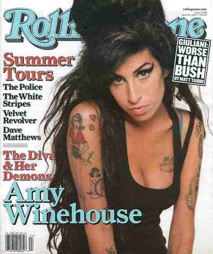
            Secondly I researched the Rolling Stones magazine I came to the result that I believe that this was the less relevant magazine in my research as I didn’t like the layout of the page and also I didn’t believe that it was help me to gather ideas for my own magazine . I didn’t like the layout of the magazine because of the design , I believe that there should have been more text around the page and also to have more interesting bold colours that blend well together . I think this would entice the readers eyes to the front cover more. Meanwhile I do like the idea of the image in the middle of the page and the text around the figure. But I do believe that the colour scheme lets the magazine down as it is very dull and uninteresting

http://www.rollingstones.com/


And lastly I like the layout of this magazine as I believe that the image looks very active and outgoing, and it gives off that effect on the magazine itself. I like the layout of this magazine as I believe the image gives off a really good effect throughout the whole front cover. I think that colours chosen work well as they are very bold and contrast against the image making everything stand out. Also the bold black writing used against the white background makes the writing stand out and appeal to the reader. Finally the masthead works well because of the font used and also the colour, the slice effect used in the masthead gives off the effect that the magazine is slighting underground and street but trying to remain formal.

http://en.wikipedia.org/wiki/Natalie_Portman


Photograghy Research

 
I have researched many different front pages of R&B / Hip -hop magazine and the way there images are positioned are normally showing a mid - shot of the artist featured in side. The image is normally a full photo that covers the whole page. The text on the page hardy covers over the figure and usually sits on one side of the page .The photo is normally a glossy photo to attract the reader to the fresh clean good looking model on the front cover as it is normally the first thing the readers see when they pick up the magazine. In this magazine I have noticed that the figure on the page has matching eye shadow to the mast head.  I have decided to use the idea of using a glossy photo to attract the readers to my magazine. I believe that I will have text covering my photo as I don’t want the image to fill the page as I want there to be a lot of text on the page to keep the reader interested.


Mix Mag

 
I have researched many different types of magazines featuring  different genres such as hip hop , R&B , club , techno ,  dance , dub step and rock .This has helped me understand the different concepts of target audience and unique types of music genres . Mix mag is aimed for a specific target audience , particularly aimed at older teenagers and people in their twenties .The background of the front cover matches the writing as the colour of the writing is a lighter purple compared to the background .Allowing it to be easier for the reader too read the subheadings and captions . As the background is dark and the picture is light it brings the figure out and makes her look bold and emphasises the point of the disco theme. The purple is very neutral colour that can attract both male and female readers it also contrasts with the disco theme of mix mag .


Monday 21 March 2011

Preliminary task presentation


Flat Plans for Preliminary Task


  For the preliminary task was to create a magazine that was related to the Acland Burghley School such as a new school magazine that was for the students to have on a weekly basis . I believe that this task was easy once I was able to get onto the apple Mac’s and use the different software’s available .By creating a flat plan I believe was a good idea as I was able to gather thoughts and ideas on a piece of paper without getting stuck trying to think of ideas on the computer .
My first edit for the preliminary task shows above. I decided to design my preliminary to fit the purpose of creating a school magazine for students at Acland Burghley. The magazine includes a title, masthead, strap lines, inside features and the correct mode of address to fit the purpose. I firstly planned out my prelim task on paper to gather ideas and make sure everything could fit onto the page.
I also created a flat plan of my contents page to show how I wanted to layout the the images and text around the page.  By doing a flat plan of the contents page I was able to view and make changes if I believed the layout wouldn't work. 
I then created both pages using photo shop and pages; this enabled me to change the photographs and add different fonts and colour to colour cord the page. By using pages I was able to layout out the page very freely and drop images around the page. By creating my prelim I was able to do research and planning to view other magazines and get ideas for my own magazine cover. My prelim allowed me to discover a range of techniques to use on my magazine , It also allowed me to learn from doing my prelim how I could improve my magazine in the future  , by the corrections needed to be a proper magazine .


Having chosen the genre of hip-hop R&B for my music magazine. I decided to research "Billboard magazine .By analysing this front cover I was able to collect different ideas on front covers. On this cover the masthead is very bold and strong allowing it to catch the reader’s attention when looking on a magazine section. It also features three different colours between the three middle letters.  There main image covers the entire page, with a famous singer on the front cover "Janet Jackson”. Having this figure on the front cover would also attract the reader to buy the magazine because she is very popular and trendy .In my magazine I have decided not to have a famous artist on my front cover but an up and coming artist that would be featured on my double paged spread . The strap line posted on this front cover is associated with image covering the page, linking them together shows they work. In my magazine I would like to link the pictures with the text, So that the strap line and the image are connected together. In the front cover all text is featured on one side of the page to avoid covering the singers face. In my magazine I believe that ill have text on both sides of the page. There is also two lures on the front of the page to want you to read on: "call on me, with Nelly " and "So excited featuring KHIA ". I think it’s a good idea to have a lure on the front cover of magazines as it interests the reader more to buy the magazine if there is something interesting to read on about. This magazine also features the essential front cover codes and conventions that are not elaborated above: price, date of issue, bar code and mode of address.

The music promoted by this magazine and also advertised on the front cover is shown in the link below:


The News Musical Express

   
From the image was above was a masthead that I explored the dept , considering the different codes and conventions throughout the bold masthead there to attract the reader or buyer .Nme is one of the most UK branded popular music magazine which focuses on the rock and indie music genre . Although it’s not that I want to feature or focus on that sort of music I believe that it was a good idea to look at different genres style of music magazines, To gain ideas to use in my own magazine .By looking at this masthead I believe u cannot tell what sort of music the magazine is about as the masthead is very formal and unique . As the masthead is Bold it stands out to most readers as the white outline that lays on the black creates the effect of the letters to be sharp and signified. The red that fills the colour is also very vibrant and eye catches. Another convention used in the masthead is that the three letters have meaning such as News Musical Express, I believe that this is a good way to simplify long titles.

Top of the Pops exploring techniques and further ideas

The top of the pops magazine caters for a specific target audience that are young and vulnerable to buy the magazine  aged around 8-13.You can tell this the masthead as the writing is as like a bubble writing style chosen to attract the attention of a young child . Also as the masthead is coloured as bright pink and glittery  inherses the fact that it is proven to attract a wide of  females . I have also noticed that in most of the top of the pops magazine they have the main featured artist on the front cover over lapping the masthead showing identity of the magazine .


Friday 18 March 2011

Research into the music genre of R&B + Hip-Hop

As i decided to feature my main task towards a R&B / Hip-Hop style magazine i decided to base most of my research on the Internet on websites and music clips that focus and revolve around this style of music :
Theses online magazines have given me ideas to put in m own magazine and also to conclude what type of target audience i would like to portray my magazine to. By looking at theses online sources for magazines i was able to contrast the difference between them all and also i was able to formulate my own ideas to use in my magazine later on into the project . I  believe that looking at these magazines helped a lot when i started planning for my preliminary task . As they as feature the variety of hip - hop / urban music i had a greater understanding of how to create a music magazine that would be able to sell to my target audience .

Research and planning

Before i had decided to choose the genre of hip-hop  / R&B  for my magazine . I choose to research many different websites to get idea of what i wanted my magazine to feature and also to help to choose the right target audience .
Looking at the Mix Mag website i was able to get a range of ideas of what i want to feature in my magazine and also the target audience i would like to portray to my audience .i believe that the website helped me create a range of different ideas to start to build my own magazine by the things featured in a weekly issue and also placed on the website

http://www.kerrang.com/

 By looking at the Kerrang magazine website i was able to decide what genre I actually wanted top focus on as I believed that the music I should make my magazine able is something that I listen to
regularly and am passionate about. I didn't like the layout of the Kerrang website and i felt it wasn't relevant towards my work .
http://www.rollingstone.com/

And  finally I looked at the rolling stones website although it wasnt relevant to my target audience or genre I believe it was a good part of my research as I was able to read and look into diferrent gernres other than my own choice . I like the layout of the online magaizne and the website as it was simple and easy to find articles and different thing osoceated to music .

Research into the music press

The music press is there to attract all age range from 12 - 60 . The different types of genres allows everyone to have there own choice and variety of music.Some magazines are sold in large stores such as whsmith and hmv , Otherss the are not so popular are found in more smaller stores and local newsagentcies. Throughout the music press , music is publicized in many ways such as the internet on sites such as youtube , myspace and facebook .Another way to publicize music is using events such as raves and gigs allow new artist to have a chance to expose their music infront of big audiences .Some music magazine even have the own websites and  ditgital tv channels such as kerrang publicinzing rock and pop music . whereas on the other hand digital channels such as kiss 100 have a radio show where they play music to attract a range of listeners.

Main Coursework Task

The main task to be produced for my coursework task was to be able to create a music of my choice .This blog was to include a preferable target audience,genre and other necessary code's and  conventions to make a successful outcome .
In my main coursework task for my music magazine i have decided to create a monthly magazine . That is aimed to attract and appeal the age range of 16 - 19 . i believed that this was a better age range for me to work with as it is my own age group and i would more likely know what an 16-19 year old is in to rather than a 12-15 year old . I have chosen to do a hip-hop / r&b .soul , funky and up and coming artist ( underground )magazine to express now modern generation. I decided to choose theses genre's of music as coming from an urban community i believe this is what most of the young teenagers are interested in to read and gain knowledge about . Also the genre of music relates to young people significantly as they seem to listen to these sorts of genre of music shown by recent research studies on urban teenagers . I believe that this research is partly true as when you turn on the radio to local stations they are trying to discover young talented artist such as tinchy stryder and tinnie tempah both coming from urban backgrounds . This magazine will as feature a recent update  of local underground events and  new album releases .

Media Press

The media press is very influential in all of our everyday lives as see, read, and hear the latest about the world each and everyday . The news about the world is featured in many different ways such as television , magazines / newspapers , radio and flyer's . For my A level task i have been set a task to create a music magazine for a specific age range . The media press is there to expand the lives of different people as they can read and listen or watch a variety of different genres for their own taste . In my blog and research i will be focusing on the magazine industry . Most music magazines come out every fortnight or every month allowing people to keep up to date with the latest music and up coming artist .

Personal Profile

Hello .
My name is  Ria St Louis Kerr I am Year 12 student at the La swap sixth form currently studying media studies as well as two other A-levels .
This is my blog space where i will upload all my recent and update work for my media studies As coursework . This will as included my decisions on my target audience, my music magazine genre and how often my magazine shall be issued .Throughout my blog i wish to include all of the necessary codes and conventions  needed to make a successful music magazine and amend a good coursework grade ☻ .